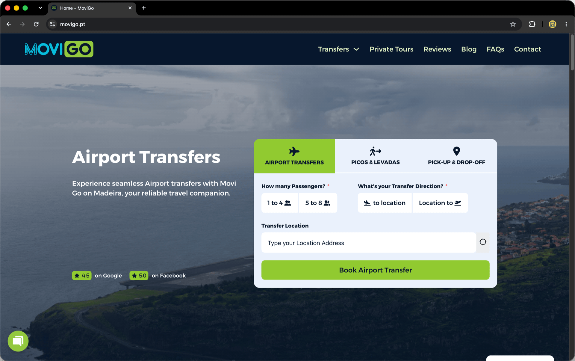

Movi Go is a modern transfer company based in Madeira Island, and their brand needed a logo that was both energetic and trustworthy, reflecting movement, accessibility, and digital simplicity. We developed a vibrant, adaptable identity that captures exactly that.
The logotype plays with two contrasting styles: “MOVI”, in a light blue, rounded sans-serif, features a stylised “M” made with line connections and nodes, evoking the idea of a network or transport route. In contrast, “GO” is placed inside a bright green capsule, using bold, geometric forms that suggest action, forward motion, and ease.
The final result is a clean, digital-friendly logo that stands out across platforms, from vehicle wraps and uniforms to mobile apps and websites. This brand mark communicates clarity, speed and professionalism, perfectly suited for a company that moves people with efficiency and care.